Building Dark Mode for hamatti.org
Aug 24th, 2023
I’m one of the people who’s answer to “light or dark mode” is 95% of the time: “whatever is the default”.
This is especially true in web where I often struggle with enjoying dark mode as most images, photos and in-site graphics feel like they are out of place with their bright backgrounds. That, alongside the fact that my old website codebase just made it very hard to even attempt, has kept this site on the light mode for everyone.
Until now!
Starting today, hamatti.org can be browsed with dark theme.
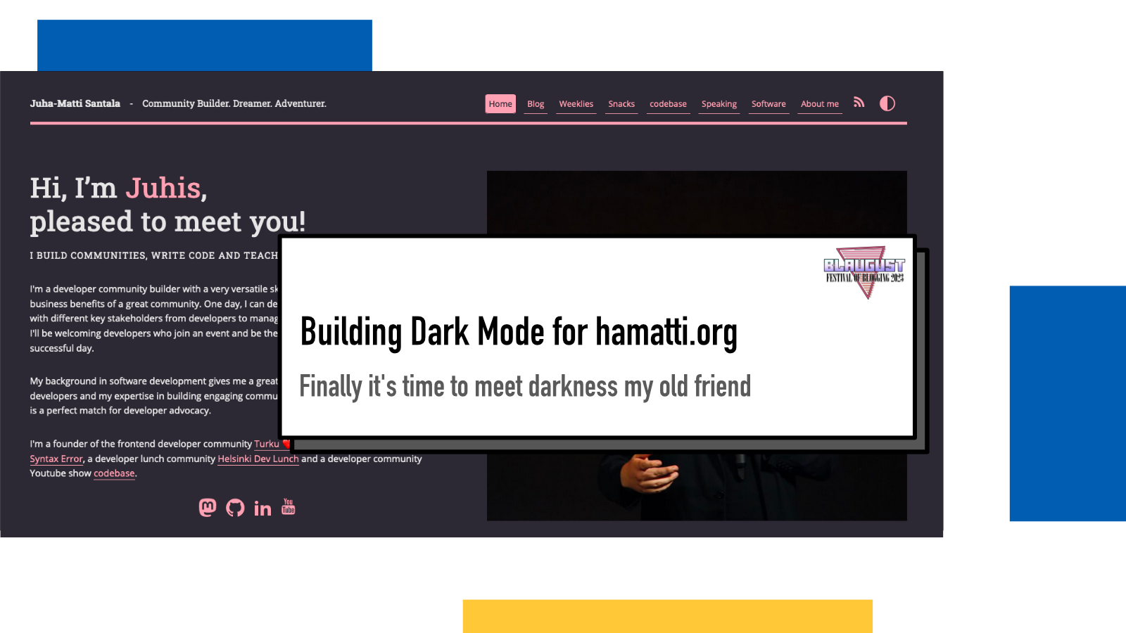
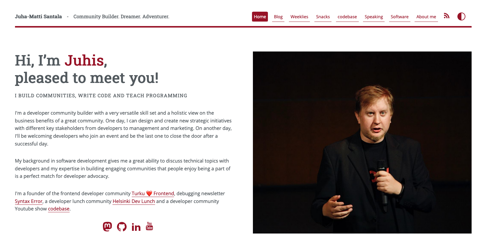
Let there be light
By default, the website is on light mode and looks like this at the time of writing
Hello darkness my old friend
And when dark mode is requested, the accent color goes pink, text off-white and background dark
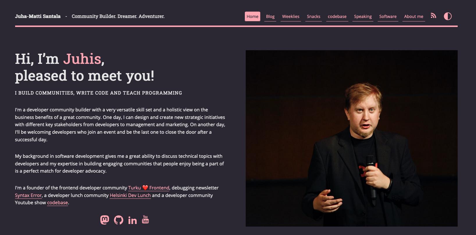
A really difficult decision was to choose the new accent color since that dark-ish wine red has become a really big favorite of mine but I’ve always loved pink and I think it looks pretty cool.
A look under the hood
To start working on the dark mode, I added a
data-theme attribute to my
body element. That will be used as the
CSS target for different coloring.
After that, I added a button at the end of my navigation to allow the user to
manually switch between dark and light modes:
<li><button
    id="toggleTheme">(icon)</button></li>
The changes are being controlled by a couple of Javascript snippets:
The first part is two functions that save and load the user preference from localStorage:
function saveTheme(theme) {
  localStorage.setItem('theme', theme)
}

function loadTheme() {
  return localStorage.getItem('theme')
}
Second, a function that handles changing of the theme:
function changeTheme(newTheme) {
  document.body.dataset.theme = newTheme
  saveTheme(newTheme)
}
On page load, I check if the user has a preference through localStorage, browser or operating system settings (using prefers-color-scheme media query):
let savedTheme = loadTheme();
if(savedTheme) {
  changeTheme(savedTheme)
} else {
  let theme =  window.matchMedia && window.matchMedia('(prefers-color-scheme: dark').matches ? 'dark' : 'light'
  changeTheme(theme)
}
Finally, I have event listeners for if the media query changes or user clicks the button to manually change:
window.matchMedia('(prefers-color-scheme: dark)').addEventListener('change', event => {
  const newTheme = event.matches ? "dark" : "light";
  changeTheme(newTheme)
});

const modeToggle = document.querySelector('button#toggleTheme')
modeToggle.addEventListener('click', ev => {
  ev.preventDefault()
  changeTheme(document.body.dataset.theme === 'dark' ? 'light' : 'dark')
})
In CSS land, I defined new colors for the dark mode:
body[data-theme="dark"] {
    --brand: #ffa6b3;
    --text: #e6e6e6;
    --color-background-primary: #2b2833;
    --color-text-primary: white;
    --shadow: rgb(228, 220, 220);
}
It took a lot of tinkering and testing to get the colors right and I’m still not 100% sure if I’m convinced.
One thing that I haven’t done yet but I think I should is to solve the original issue: I have a lot of in-site graphics that are designed with white background in mind and pop out in a way that shouts “I don’t belong here” to my face.
Finally, I added a tiny animation to rotate the button 180 degrees while applying the new theme:
body[data-theme="dark"] button#toggleTheme {
  transform: rotate(180deg);
  transition: 1s;
}

button#toggleTheme {
  transition: 1s;
}
It’s my first ever CSS animation!
Inspiration
A big shoutout to a few blog posts that inspired me to finally tackle this (and for practical tips!)
- Salma’s The best light/dark mode theme toggle in JavaScript
- Sarah’s Building an accessible theme picker with HTML, CSS and JavaScript.
- Adhuham’s A Complete Guide to Dark Mode on the Web
- Sia’s How to build a website in 2021
If something above resonated with you, let's start a discussion about it! Email me at juhamattisantala@gmail.com and share your thoughts. This year, I want to have more deeper discussions with people from around the world and I'd love if you'd be part of that.