codebase ep. 4: Web Components with Matias
Jul 14th, 2021
codebase is a new developer community show on Youtube. It's a celebration of technology and different people working with different technologies. Each episode, I'm joined by a guest who knows something I don't. Together we chat about life and tech and build something live on stream.
To celebrate the sunny summer days, Matias Huhta, a software engineer at Simplr Oy, web component enthusiast, e-sports fanboy and an open source lover, joined me in the fourth episode of codebase to show what power lies in the realm of Web Components.
If you want to know when new episodes of codebase come out, subscribe to the Youtube channel.
What are Web Components?
Matias described the idea of web components as "an API that lets you create custom HTML tags which run custom code". Web Components are very well supported in modern browsers and require close to zero tooling, which makes them very easy to get started with. No need for configuring webpack or other build and bundling tools.
Let's take a look at a example of custom counter button we started the live coding portion with. All the examples can be found at Matsuuu/Codebase.
class CounterButton extends HTMLButtonElement {
    constructor() {
        super();
        this.count = 0;

        const counterText = document.createElement("p");
        counterText.innerHTML = `I've been clicked <span>${this.count}</span> times`;

        const counterField = counterText.querySelector("span");

        this.parentNode.insertBefore(counterText, this);

        this.addEventListener("click", () => {
            this.count++;
            console.log(`I've been clicked ${this.count} times`);
            counterField.innerText = this.count.toString();
        });
    }
}

customElements.define("counter-button", CounterButton, { extends: "button" });
To build a custom web component, all you need is 1) a Javascript class that extends an existing element (in this case, HTMLButtonElement) or HTMLElement if you're not building on top of existing functionality, 2) a constructor that defines the functionality and 3) defining it in the customElements API.
The CounterButton in the above example can then be used just like a regular HTML tag in your html:
<html>
  <body>
    <button is="counter-button">Click me!</button>
    <script type="module" src="./counter.js"></script>
  </body>
</html>
Fast hot reloads
The feature that caught my attention during the episode was how fast the hot reloads were. To truly see that in action, watch the stream. Since there's no build step, using npx @web/dev-server --watch --node-resolve server provides immediate refresh on the browser when you change your code.
As I mentioned in the blog post for second episode, having a quick feedback loop is something I really enjoy. Minimizing the time it takes from changing the code to seeing the result increases my developer happiness and enables a faster iteration cycle.
Shadow realm... err, DOM
A concept called Shadow DOM offers encapsulation to Web Components. It protects the components from the outside styling and protects the page using those components from having their styles spill over.
A simple example shows how CSS is affecting different DOMS:
<!DOCTYPE html>
<html lang="en">
  <head>
    <style>
      p {
        color: red;
        font-size: 2em;
      }
    </style>
  </head>
  <body>
    <p>Example in the normal DOM</p>
    <shadow-example></shadow-example>
    <script src="shadow-example.js"></script>
  </body>
</html>
class ShadowExample extends HTMLElement {
  constructor() {
    super();
    this.attachShadow({ mode: "open" });

    this.shadowRoot.innerHTML = `
        <p>This is a p tag inside the shadow DOM</p>
    `;
  }
}

customElements.define("shadow-example", ShadowExample);
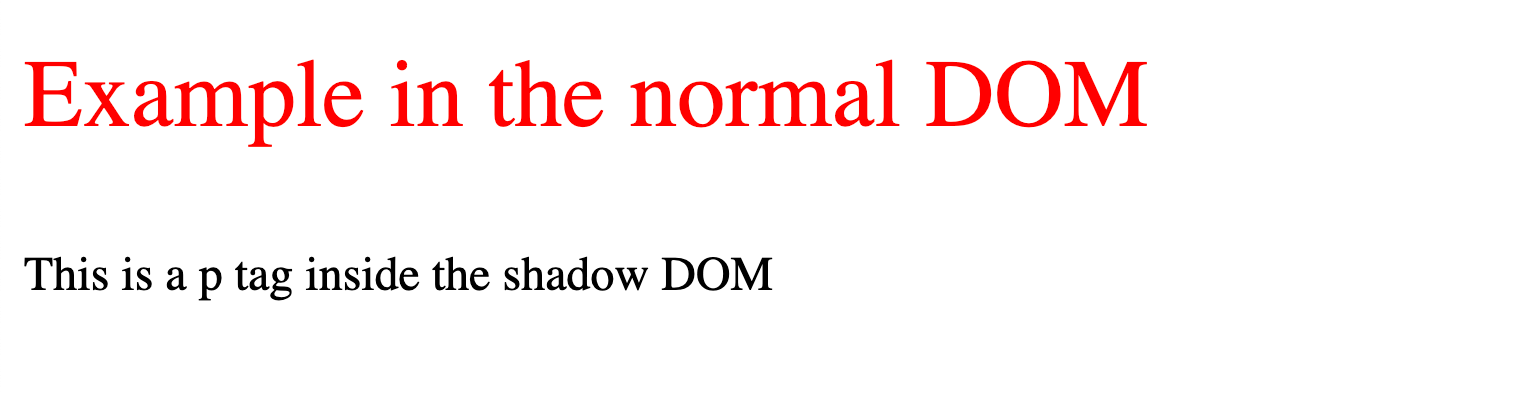
As you can see from the screenshot, the <p> tag we defined in the shadowRoot is not affected by the top level CSS.
Web Components DevTools
One thing we mentioned but didn't have time to go through in the episode was Web Components DevTools that Matias has been building and open sourced right after our live stream.
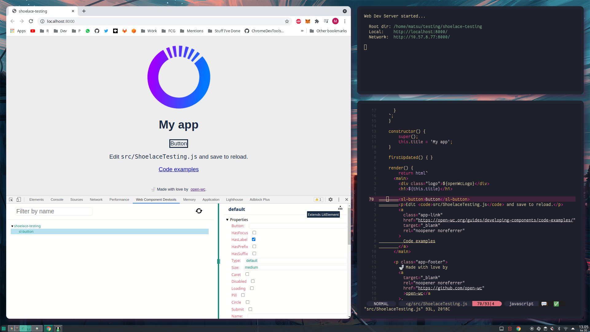
Having great tooling is crucial and now Web Component developers can get access to tooling right in the browser's dev tools while developing their components.
I highly recommend checking the tool out if you're working with Web Components.
Learn more
Matias was kind enough to provide us some further resources if you got interested in Web Components.
- Web Components | MDN
- Open Web Components
- Modern Web - Guides, tools and libraries for modern web development
- Lit - a library for building Web Components
- Web Components: from zero to hero blog series
If something above resonated with you, let's start a discussion about it! Email me at juhamattisantala at gmail dot com and share your thoughts. This year, I want to have more deeper discussions with people from around the world and I'd love if you'd be part of that.