Highlight Mastodon posts by hashtag with Stylus and :has

I like that Mastodon provides a way to follow hashtags. It’s a great way to find new people to follow and new things to read or watch for given topic. But I wish there was a clearer indicator for which posts are hashtagged and which are from people I follow.
This is because I put more value on those that I follow so I read them with more thought and just glance over the ones that come from a hashtag.
Now, this solution isn’t perfect because it does not separate followed accounts who used the hashtag from non-followed accounts whose post is on my feed because I follow the hashtag. But it’s a smaller issue for me personally so I haven’t bothered to do anything about it for now.
The power of custom CSS
Using Stylus Firefox extension and the power of the new :has pseudo-class, I added a visual indicator to my feed when using the browser.
Each post in Mastodon is an article and
each hashtag is a link
<a href="/tags/[hashtag]/">.
Thanks to :has, we can now target articles that have a specific hashtag:
article:has(a[href="/tags/python" i]) {
  border: 1px solid orange;
}
Let’s walk through this selector:
-
articlematches every<article>element in the page -
:has()pseudo-class filters the articles down to ones that have at least one child element that matches what’s inside there -
amatches every<a>element -
[href="/tags/python"]filters those anchor tags down to ones that havehrefattribute that matches exactly/tags/python -
imakeshrefmatching case insensitive so it matchespython,PythonandPyThOn
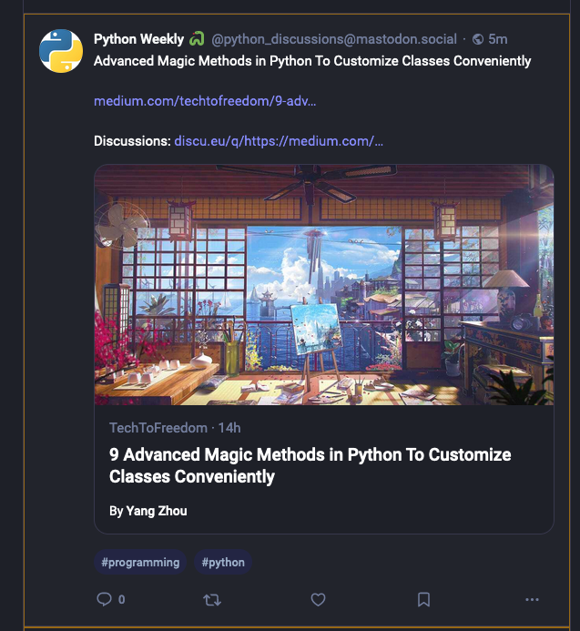
In the web, it looks like this:

(this example is from https://mementomori.social that uses Mastodon Bird UI)
I’ve been experimenting a bit with different approaches to add the highlight because I want it to be easy to notice on a glance but not something that steals the focus. Right now, the slightly dimmed orange has been a good one but I’ll adjust it as I go and eventually find something that is spot on.
If something above resonated with you, let's start a discussion about it! Email me at juhamattisantala@gmail.com and share your thoughts. This year, I want to have more deeper discussions with people from around the world and I'd love if you'd be part of that.