Use pangrams to avoid mistakes in conference badge prints
The quick brown fox jumps over the lazy dog.
If you’ve ever worked with computers or fonts, I bet you’ve seen that seemingly nonsense sentence multiple times in your life. It’s an example of a pangram – a sentence that contains all the letters of the alphabet in given language. I’ve wanted to write about pangrams for a long time.
Character errors in conference badges
I’ve organized a few (hundred) events during my lifetime and I’ll admit, things haven’t always gone smoothly when it comes to printing name badges of partipants.
This is especially bad when it’s about people’s names: many of us are very emotionally connected to our names and not taking the moment to guarantee they are correct can feel understandably bad.
Like this badge of Adrià Mercader who is no stranger to having his name written wrong.
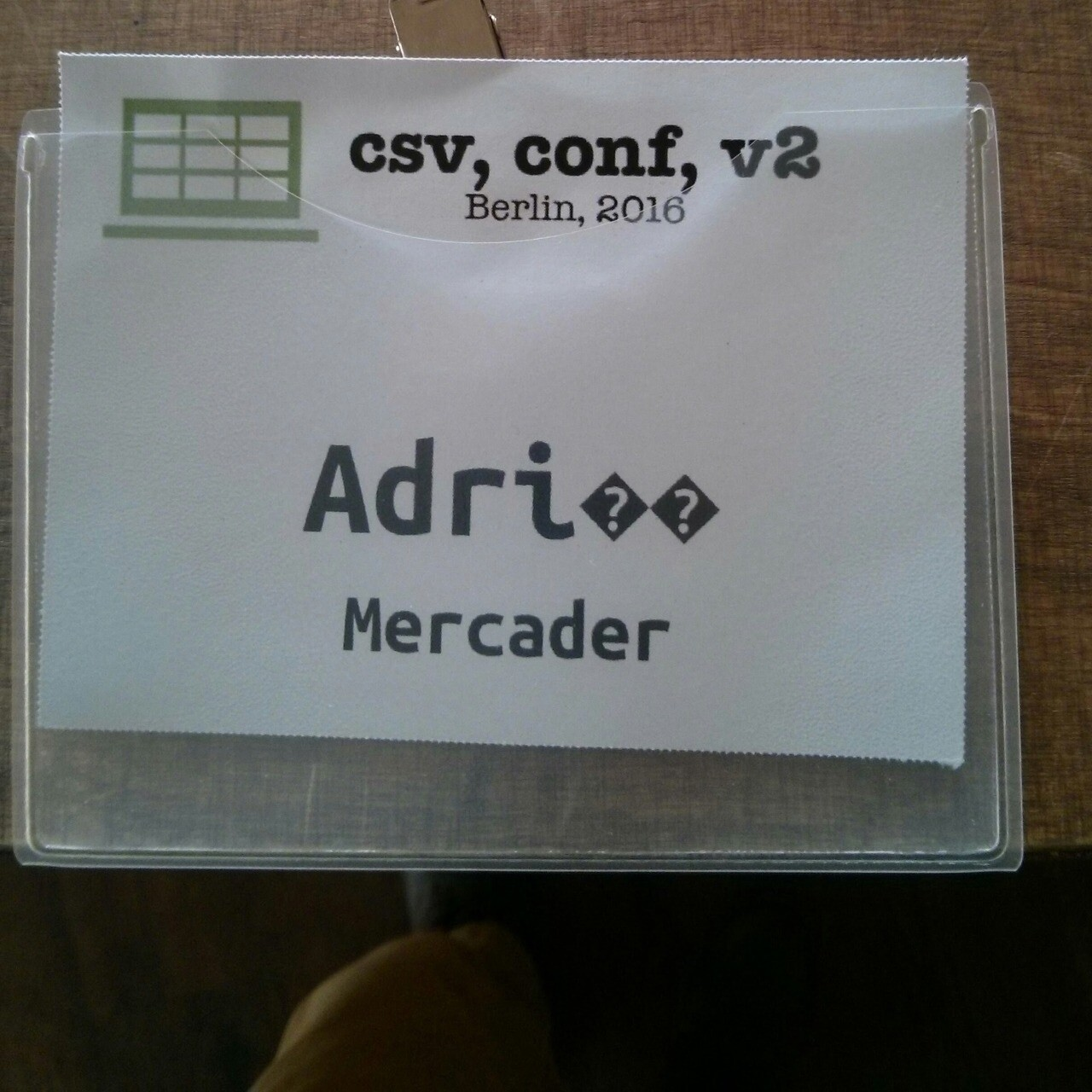
The reason this often happens, is that organizers pick a font that looks nice and then sends the list of names that come directly from visitors to the printer and with non-ascii characters, mistakes can happen.
Make pangrams a part of your design system or brand guidelines
When you are working your events brand guidelines or building a design system for your website and prints, consider adding multiple pangrams in various languages to your system, displayed in the font you are using.
That’s what the fox is doing when it’s jumping over that dog: it’s helping you see on a glance what any given font looks like for every letter. It’s very popular but it only deals with letters a to z without any diacritics or other letters available in other languages.
Luckily, Richard Rutter has saved an extensive list of pangrams that was deleted from Wikipedia.
For example, if you want to make sure your Finnish visitors have their names written correctly, you can add “Charles Darwin jammaili åken hevixylofonilla Qatarin yöpub Zeligissä.” to your design system to see if ä, ö and å are displayed correctly. To help your Czech friends avoid awkward question marks in their names, you can add Nechť již hříšné saxofony ďáblů rozezvučí síň úděsnými tóny waltzu, tanga a quickstepu. And the list goes on.
Having these in a single page of your design system or brand guidebook helps spot irregularities and missing characters in fonts. I strongly believe it’s not just about if the character will print (some fonts or systems may use fallback fonts) but it must print in equal style to others. When fallback is used, the font weights or styles don’t often match and it becomes obvious that the original, beautiful and carefully selected font wasn’t inclusive of all participants’ names.
And finally, do a quick run of all the actual names using your desired font once you have the name list before sending them to print – and be willing to adapt the font if any names show up misprinted.
Getting your badge with your name printed wrong is a guarantee that the participant will remember your conference – but their first impressions won’t be great.
Basic fonts often do well, custom ones start to show issues
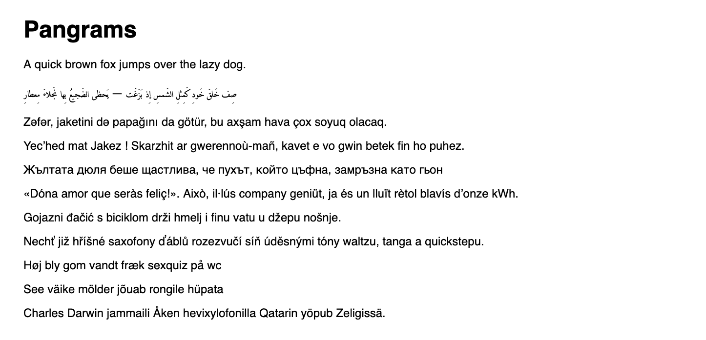
Basic fonts like Helvetica do usually very well, here’s an example of that:
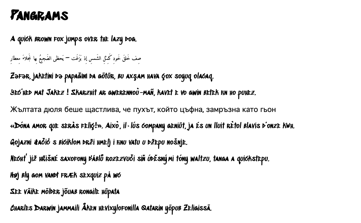
Other fonts like hand-writing style Sedgwick Ave Display is surprisingly good but lacks cyrillic for example:
And finally fonts like Tulpen One show the issue of not every character being made the same
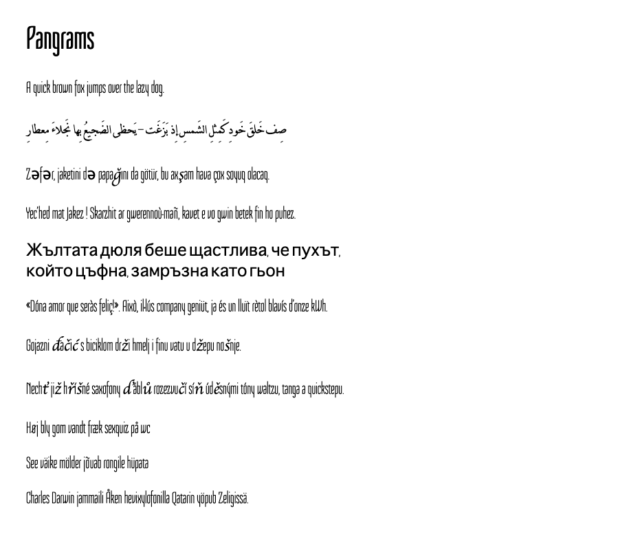
Given that you can control most of the things written on your materials like website and print, you can use almost any hand picked font for those. But for your badge name font, you can’t control what characters people have in their names so you should be prepared with a font that works with every name.
If something above resonated with you, let's start a discussion about it! Email me at juhamattisantala at gmail dot com and share your thoughts. This year, I want to have more deeper discussions with people from around the world and I'd love if you'd be part of that.