Potluck is a semi-universal deck that fits into a pocket and plays dozens of different games.
Combining travel and board games is not the easiest puzzle in the world. Board games often come in large retail boxes and even with smaller boxes, carrying multiple of them in a backpack is not really feasible.
Potluck was born out of that problem in my life. I'm always on the move and meeting people around the world and wanted something that I can always carry with me and quickly bring to the table to play a game or two.
It has been inspired by universal card systems like The Everdeck, Glyph or Singularity Deck but differs mainly in that it does not try to be fully universal but rather incorporates direct elements from specific games into the cards.
This trades off flexibility to improved experience of playing actual great games without having to do constant mental math.
Potluck is a spiritual successor of Project 108. It fixes many of its annoyances and adds new features.
Features
I wrote about the features also in a blog post.
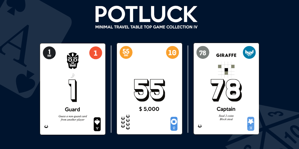
Potluck deck consists of 106 cards: numbers 0, 00 and 1-104. Each card is used for multiple games.
- 1-104 with 1, 2, 3, 5 or 7 bullheads in the bottom left corner for eg. 6 Nimmt! and No thanks!
- 8 suits of traditional playing cards (2-10, J, Q, K & A)
- Role names & rules for different role or text based games (eg. Love Letter, Coup, Mascarade, For Sale)
- 1-15 in 5 colors for eg. 7 Signum and Lost Cities (with 3x handshake cards in each color)
- Move cards for grid based games, eg. Onitama
- and much more...
Can I get one?
As I've been sharing pictures and stories about Potluck, I've started to get a lot of questions if Potluck is available to buy somewhere. The short answer is no.
The longer answer is still no but with a few remarks. Potluck is a passion project built to fix a problem I had in my life. It's a hyperspecific solution: it's designed to play the games I enjoy playing.
First, there's the financial reasons. Potluck is a prime example of a product that is not financially viable in the scale I would be selling it. I did some back of napkin math the other night and I'd have to charge somewhere around 100 and 150 euros per deck to cover costs of printing (in small scale), shipping to me, shipping to customer, taxes and a tiny profit. I honestly don't believe people would pay that much for it.
Second, the UX is not great for a product. While I'm rather confident my product does not break any copyright laws, I cannot provide any rules for the games it's designed for and probably not even a list of games as I can't use other's trademarks to promote the product. Selling you a deck and saying "figure out yourself how it works" is perfectly fine for a hobby project built for myself but not a great experience for a buyer who wants to play games.
Third, I don't have business infrastructure to set up shop and even small amount of sales would risk my potential future social security benefits like unemployment benefit to pay the rent and that's a risk I can't take.
I keep sharing the project to show that you can build your own and to inspire you to do it. The benefit is that you can build it to fit exactly your own desires! You choose the games and how it looks like and how it plays.
Design
I wrote about the design also in a blog post.
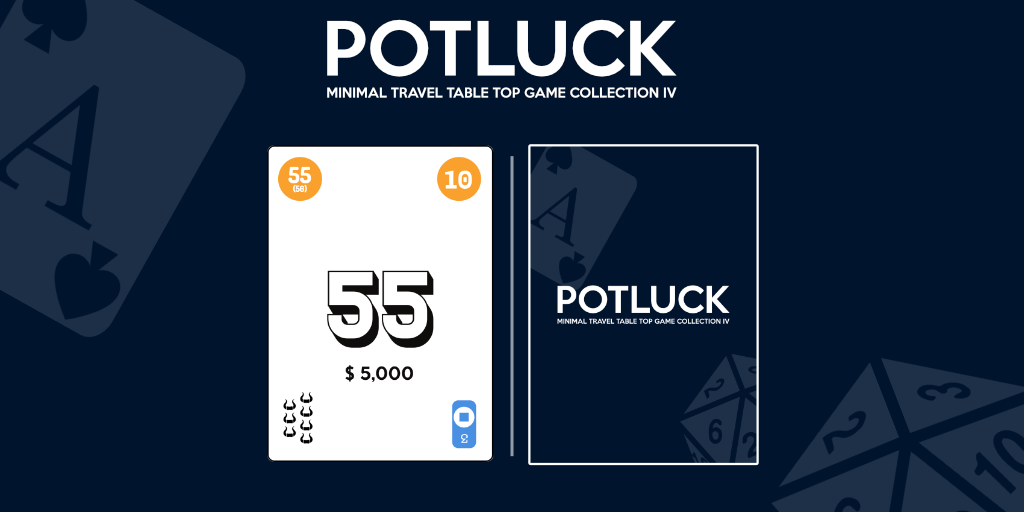
In the design, I've aimed for clarity and ease of play. When compared as a set of 106 cards, the card designs may not seem super balanced. This however is not a problem when actually playing games since you'll always pick up specific cards out from the deck and focus on one or at most two different elements on each card.
Corners and (a)symmetry
A traditional wisdom in making playing cards is often to make them symmetric over the diagonal. That way, the player can hold or play a card in either orientation and it's easy to read.
However, in a deck that aims to support multiple games, this is a trade-off that I had to give up early on. With a year of playing with my Project 108 deck, I've noticed this not to be an issue.
Fanning cards in a way that only the top left corner is visibile, is a very common way to hold cards. That's why the main element ‐ the running numbers ‐ is on the top left of each card. This was a major flaw in Project 108 that was fixed for Potluck.
The suits & values of traditional playing cards are upside-down so you can play with them on the top left corner by rotating the entire deck 180 degrees.
Twice the 4 suits or 8 suits?

A major pondering was whether to have the classic suits (♥, ◆, ♣, ♠️) twice or to bring in custom secondary suits.
I decided to create a secondary set of suits: stars, coins, triforce and swords in blue & green to add some extra options for playing. This means that you can play games that need up to 8 suits (like the great Parade or Arboretum).
I tried to incorporate the Italian suits (coins, cups, sticks and swords) as the secondary suits but it was hard to make sticks and swords distinct enough with the simplified icons that I decided to skip that.
Necessary trade-offs
There are some very necessary trade-offs that could be annoying to very hardcore players.
For example, in a game like Coup, it can actually matter a lot if two cards of the same role, eg. Captain, are actually the same or different card. With Potluck style deck, that is impossible to do as there are so many varying elements.
This can tilt the balance of some deduction-based games a bit but honestly, I'm not too worried. If my game crew would get upset with that, I'm probably in the wrong group at that point anyway.
Leveraging existing information
The most subtle thing in Potluck is how games integrate elements from each other and from the real games to help game be easier on a glance.
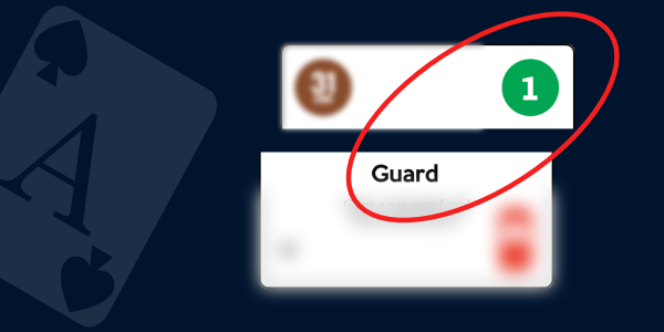
For example, the Love Letter roles (Guard, Priest, Bishop, etc.) are in cards so that the 7 Signum values on the top right corner match the ranks of those cards in the original Love Letter (1-8).
Or in Coup, the roles are matched with 7 Signum's colors to match the original colors of the cards in Coup: Captain + Blue, Ambassador + Green and so on.
An index or no index?
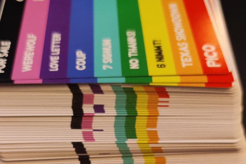
When I designed Project 108, I created a colorful index on the side for quick find of the favorite games. It felt like a great idea during design, it seemed still a great idea when I got the cards.
But I ended up never using it. It wasn't necessary. I keep the cards sorted in numeric order and have created some custom cheatsheets so I know which numbers I need and it's fast and convenient enough to find the right cards without the index.
Credits
The project was designed and developed by myself.
Acknowlegements
Big thanks to Marlo, Topi, Tomi & Sakari for the support and feedback during the project.
Thanks to all the wonderful game designers who enable this hobby for all of us. Please support the designers and your local game stores by buying the games that you like - even if playing them in an alternative format like Potluck. I am not distributing any copyrighted or trademarked materials like graphics or rules to the games this deck enables one to play.
Icons
The icons in cards and associated materials are from:
- Lorc (https://lorcblog.blogspot.com/) [CC BY 3.0]
- Delapouite (https://delapouite.com/) [CC BY 3.0]
- Faithtoken (http://www.faithtoken.com/) [CC BY 3.0]
- Skoll [CC BY 3.0]
- Simon (aussiesim) [CC BY 3.0]
Development process
To develop this project, I used a few main tools and file formats:
CSV & Spreadsheets
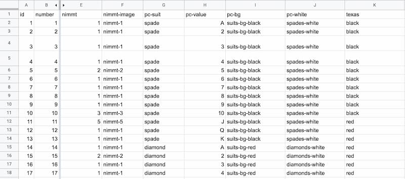
To manage the actual content, I had a massive spreadsheet that I used to easily add, remove or adjust the contents of the cards. I would then export it to CSV format for further use.
XML & Multideck
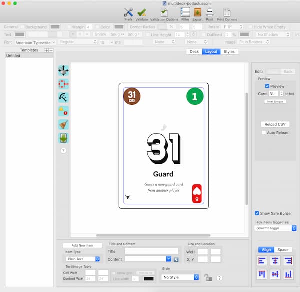
To create the layout and generate the final cards, I use Semicolon's great Multideck, a MacOS software to build decks.
It supports CSV as data source, provides very lightweight tools to visually create a card layout and stores that layout in an XML format. It struggles a bit with large CSV files (mine crashed rather often) and uses quite a lot of memory when generating images but works otherwise really well.
git for version control

As a software developer, I'm used to keeping track of changes with git version control software. Since my data is CSV and layout is XML, git works wonders with this project.
I kept track of the changes with git so I would always be able to go back if I changed my mind (and didn't have to remember what the previous state was). This enabled me to keep the project in GitHub so even if my computer would crash and burn, I could just clone the project with all assets, source data and layout files and continue working.
Affinity Designer and game-icons.net for assets
I used game-icons.net's icons extensively and used Affinity Designer as my go-to graphic design tool to create and modify my assets. Their icons are distributed with a permissive CC BY 3.0 license that is perfect for a project like this.
CC BY 3.0 license allows creators to distribute and modify the icons ‐ even commercially ‐ as long as the original creator is credited.
