Make your website printable - a short guide
Sep 23rd, 2026
Have you ever printed a web page or thought about how your website looks like if someone were to print it? Let this short guide provide you a starting point on your journey to make the reader’s experience better if they decide to print your page.
Why should you make your web page printable?
There are a lot of different reasons why someone would print a website in 2026.
First is to read a longer piece in a better format. Reading from paper is generally better for your eyes than staring a screen. I don’t do it often but every now and then, when someone writes a post that really makes me think, I prefer to print it out, take my highlighter and pen and curl up in a nice comfy chair or sofa and read it, highlight passages and make notes to the margins.
Second is to print information as a backup in case your devices run out of battery or your internet goes down while you’re on an adventure. Hotel and travel reservations, maps with directions, addresses, phone numbers — heck, even a translated menu of a restaurant might become handy for someone in some case (been there, done that).
Third is for preservation of information. Sometimes, we want to preserve digital information by printing it out and storing it somewhere. If the information is only on a website, the print styles will have a big impact on how well they can be preserved.
These are the top three that come to my mind but there’s likely way more.
In general, I think it’s all about providing the reader one more option and that’s important. You can’t imagine all ways people might want to interact with the information you provide so providing a good set of options (including but not limited to: responsive design for different sizes of screens, accessible website for different assisted technologies to interact with your site, RSS feeds, print styles) is a good way to help the reader enjoy it.
Designing and implementing print styles
Implementing print friendly styles is not very complicated if you know the basics of CSS.
At the core is a feature called media queries. With them, we can define separate styles that are only applied when a page is printed.
I like to have a separate file
print.css
where I keep all my print styles but there’s no need for a separate files. You can define these within your regular
styles and you can have multiple media queries for print scattered across if you like to keep styles more on a component
level than use-case level like this.
@media print {
	/* Your styles go here */
}
This is all you need to define a media query for print. Everything inside the curly braces will be applied when printing.
Most of print styles is hiding the unnecessary
The easiest place to start is figuring out what on your web page is unnecessary when printed.
Before we write a single line of CSS though, it’s good to take a look at your site.
Here’s an example of a recent blog post of mine.
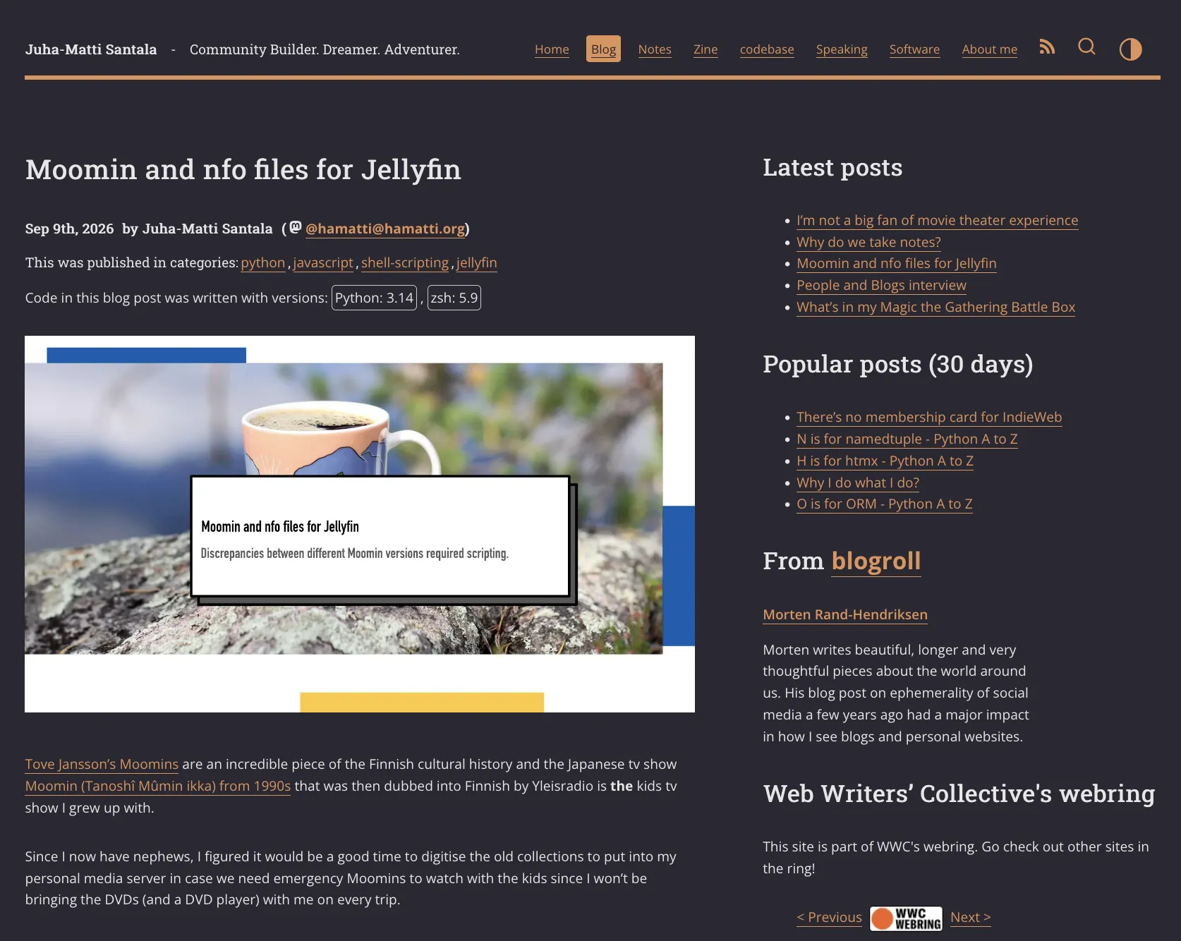
There’s a lot there and on a website, most of it is useful (at least to someone).
First thing to remove is the website navigational elements. The header with my website’s title and main navigation should go because nobody is going to “click” those on paper. Same goes for the sidebar with latest and popular posts and the blogroll for the same reason.
I have these blog post images that I mostly use to build a consistent visual style when they are shared in social media or chat platforms that show previews. They don’t provide anything for a print user so we can save some ink there.
When it comes to images, you need to think about if they provide informational value to someone reading it out of context on a paper. Some images are to make the page more visually appealing to someone reading on the web but can be removed on print. Others convey crucial information that should be included.
There are two ways I approach this from code perspective. The first one is to declare common elements to be completely removed from print. We can use display CSS property to hide these elements. For example:
@media print {
  aside,
  #layout-top,
  footer,
  .webfeedsFeaturedVisual,
  .reach-out-cta,
  #blog-container #syntax-error {
    display: none;
  }
}
This is an example from my own print style for this very page. I want to remove all the headers, footers, sidebars and some other specific elements like the hero image or call to action boxes.
Another example is to use a utility class.
@media print {
	.no-print {
	  display: none
	}
}
This way we can add it to individual elements when needed.
I like a combination of both: the first one so I don’t have to remember to add
no-print
class to the elements every
time and the other so that I can have the flexibility to change the general
rule.
Make URLs visible
Sometimes, we want to add information instead of hiding it. Since you can’t click links on paper, it becomes important to visually show them to the reader so they can follow the sources even if the original website has disappeared from the web.
There’s an easy, CSS-only way, and a harder way that requires more technical work when building the page.
We can bring these URLs visible with just CSS using these two definitions I learned from Chris Coyier years ago:
/* Show href of links after the links
 * from: https://css-tricks.com/snippets/css/print-url-after-links/
 */
a::after {
  content: " (" attr(href) ") ";
}

a[href^="/"]::after {
  content: " (https://hamatti.org" attr(href) ") ";
}
The first one applies to every link. Using the
::after
pseudo element and
attr(href), we can add the URL into the
DOM and I like to put it into parentheses after the link element.
The second one then applies to only relative links that start with
/
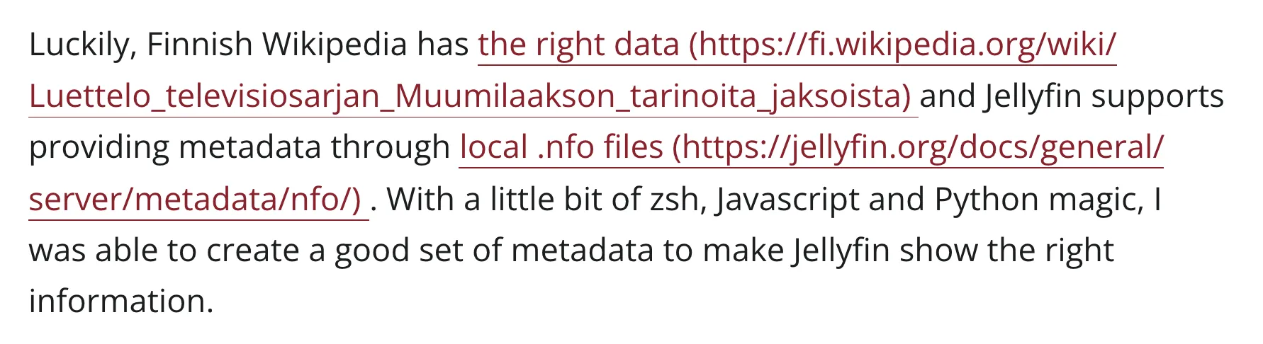
and it adds my domain in front of the actual element so they become absolute links. It will look like this when
printed:
The alternative way, which I’m thinking about implementing on my site but haven’t yet, is to add a running tally as a superscript element after each link and then list all the URLs at the end of the page and then use CSS to only show those when printed.
<style>
.print-only {
  display: none;
}

@media print {
  .print-only {
    display: revert;
  }

  a:visited {
    color: blue;
  }
}
</style>

<a href="https://example.com">Example<sup class="print-only">1</sup></a>

<!-- other stuff -->

<div class="print-only">
	<h2>References</h2>
	<ol>
	  <li>Example https://example.com</li>
	</ol>
</div>
This would result in a website on the left and print on the right:
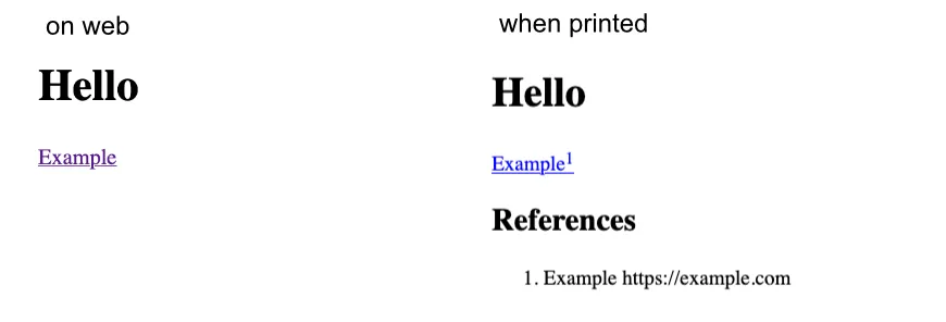
This will make it easier to read through but requires more from your website’s implementation. If you want to take that route, I recommend starting with the CSS-only approach right now and then replace it with the new implementation when you’re done with it.
It’s better to have those URLs available than to create a perfect system.
Code blocks
Code snippets — like the ones in this post — are usually shown in a
<pre>
block that preserves the
white space and doesn’t wrap by default.
To make sure everything shows up in the print, you can add
@media print {
  pre {
	  white-space: pre-wrap;
  }
}
If you’re using some sort of syntax highlight library (like I use
Prism), it can get
a bit messy. I’ve added an
!important
at
the end of mine to override settings from Prism —
!important
is usually not a good thing
to use but I think for print styles and specific use cases it’s okay.
In my site, the line numbers (provided by Prism) get messed up when printing something that wraps like this. It’s still something I need to figure out and fix.
Rest is more or less fine-tuning and polish
Open your page, hit print and see how it looks like in the preview or print to PDF and read it through. Does something look out of place? Is there still something unnecessary that could be removed to improve the experience?
For example, large tables might work on sideways scrollable media like browser but can break horribly on print. Adrian Roselli has a great article on how to create responsive tables which is helpful here as well.
Tools
You don’t have to actually print the page to experiment on your print styles when you’re developing your site.
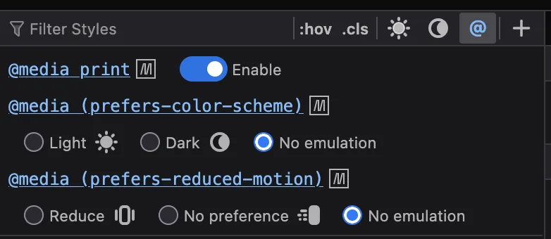
In Firefox, you can open the Developer Tools (Tools → Browser tools → Web Developer Tools), navigate to Inspector tab
and inside it, the Styles pane. By selecting the
@
mode, you’ll get a list
of media queries to toggle.
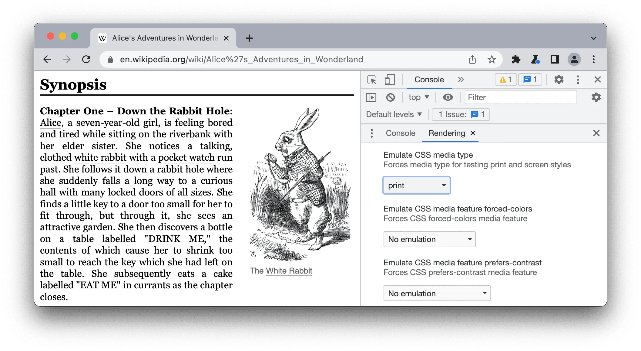
In Chrome, you can find it in Rendering tab.
Using these is handy for quick tinkering but it’s always good to confirm with an actual “print to PDF” preview because the print emulation does not affect the viewport so it might look okay on browser but break when printed to the page, depending on if the page size and orientation.
If something above resonated with you, let's start a discussion about it! Email me at juhis@hamatti.org and share your thoughts . This year, I want to have more deeper discussions with people from around the world and I'd love if you'd be part of that.