Minimal Travel Table Top Game Collection 3: Project 108
It's time for another Minimal Travel Table Top Game Collection project. If you missed the first two, you can find the first one and second one in my blog. All of these are created for my personal use only and I recommend supporting your local game stores and the creators of the original games by buying a copy of the ones you like.
First two sets were about taking existing games and creating smaller versions of them fitting into double-side printed standard cards. I created the first one out of a combination of curiosity and necessity and the second one because right when I got my first one, the world went into a lockdown and I had nobody to play with.
The motivation for this third one came last summer when I was visiting my friends and we played a few games during that trip. Games like 6 Nimmt! and Texas Showdown are wonderful small games that are nice to play in a pub or in a train or while waiting for the main thing to start. But carrying all those games separately takes quite a lot of space that I don't have in my backpack. An idea sparked in my head: maybe instead of picking up a collection of games that use limited amount of cards, I could combine multiple games per card.
Enter the rabbit hole
When I mentioned this idea to my gaming group, I got into an adventure of board game history research that I wasn't expecting. It all started with the Everdeck. Everdeck was the first so called Universal Card System I had heard of. Through a well-crafted system of lots of tables and spreadsheets it brings the ability to play a wide variety of games with cards that are beautifully designed to not look like they are made for a dozen games.
Next, I learned about The Deck of Many Dice that worked on a similar universal premise but was more focused on efficiency than hand-crafted design the Everdeck had. Both the Everdeck and The Deck of Many Dice had one wonderful thing in common: the development of both was well documented which provided me with a lot of food for thought but especially a lot of inspiration.
At this point, I knew there had to be more so I headed over to BoardGameGeek and found a great thread about Playing Card Game Systems going through the history of them and introduced me to even more attempts by different people like Singularity Deck, Decktet and Glyph.
Not quite so universal
I initially started from a small set of games I wanted to include, wandered in my research into the direction of universal systems and then decided to get back to a limited set of specific games I wanted to support: games that I like to play and know how to play.
The baseline for my set is 6 Nimmt! that uses cards numbered 1–104 and each number is associated with 1–7 bullheads for scoring. This gave me a good baseline of 104 cards to work with and start to see what other games could be built in.
Next, I added the aforementioned Texas Showdown that uses a subset of numbers between 0 and 74 and associates colors to these numbers based on which tens they belong to.
I then followed up with another trick-taking favorite of mine, 7 Signum (also known as Sluff Off!) that uses 75 cards (numbered 1–15 in 5 colors) for playing and another 27 for tokens.
Another set of games I really like playing are games with roles and social bluffing and deduction. Since I had plenty of cards in the set, I added Love Letter, Werewolf and Coup.
Finally, I included No Thanks! (uses just card numbers 3-35), Pico (uses cards 2–10, 13 and 16 with added red dots for scoring) and For Sale (uses numbers 1–30 for properties and other cards for money cards with written down dollar amounts).
And since I was making semi-universal game cards, I added the traditional game cards (A, 2-10, J, Q, K in four suits) into the corner of the cards as well.
Because it has cards with numbers, it also plays a huge variety of other games, like all the 22 found on this Geeklist or these 54 in another Geeklist.
Designing the cards
One underlying reason for many of these projects of mine is to become better at designing stuff. 2.5" x 3.5" card is such an interesting space for displaying information. I'm constanly researching how different games use that space to convey information and trying out my improving skills in that space.
Index
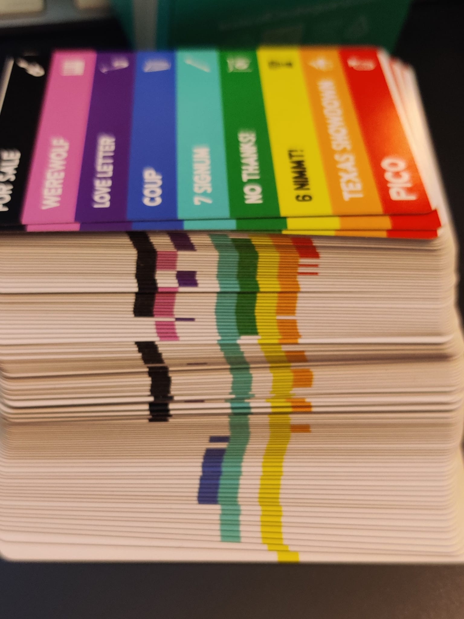
First design decision that carried through to the end was that I wanted to make it easy to pick the correct cards for any given game. When I designed the first two collections, I made cards double-sided to fit in more games but that meant I constantly needed to flip cards around when I switched games and I didn't have any system to know what was on the back of which cards and it's a bit cumbersome.
So I designed an index system: on the left side of each card, there's a selection of colored stripes (with instrument icons for added accessibility) that match the games. I included a set of 3 index cards into the mix for reference. To be honest, the system is great but the design of the index cards especially is something I didn't spend enough time to be happy with and it's probably something I'll revisit in future editions.
I was playing around the idea of having QR codes included in index cards for each game and that QR code would lead into my website with rules written there but scrapped that idea in favor of simpler design. Since I'm the only owner of this set, I know where to find those rules anyway so I decided to cut that corner.
The Anatomy of the Cards
One aspect of card design that came up over and over again in my research was the symmetry and supporting different rotations and ways of holding the cards. If you look at a traditional playing card, it's readable in any direction and no matter how you put the card in your hand, on the upper left corner you see the suit and number.
I tried to keep this in mind but given the sheer amount of information needed to fit into the card, I had to cut that idea and only have each information once on the card.
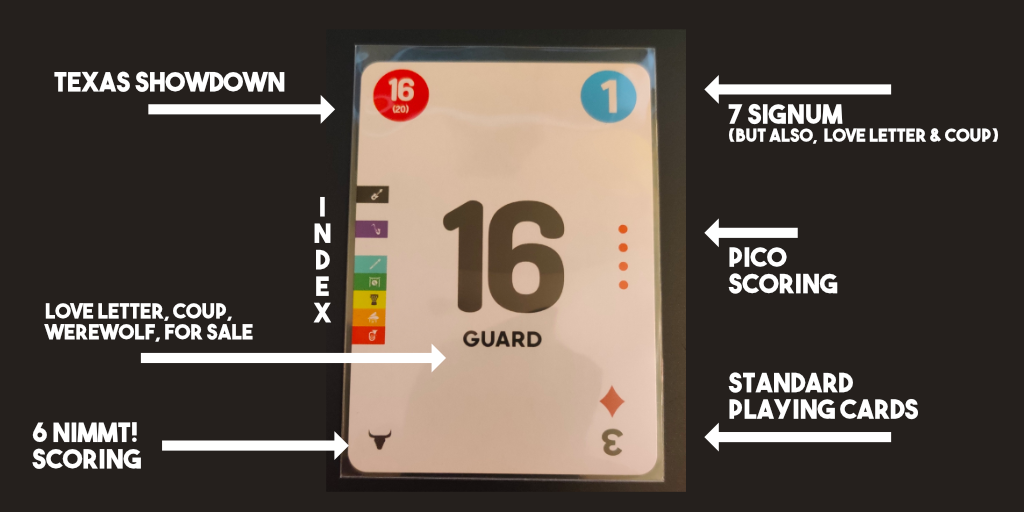
In the center in big bold font, I have the running number from 0 to 104. Below that, I used the space for games that require written information: Love Letter, Werewolf, Coup and For Sale.
On the top left corner, I have a circled number for Texas Showdown. The color of the circle denotes the color in the game, main number is for the card value and smaller number in parenthesis is the max number in that color.
On the right corner, I have 7 Signum with a colored circle and a number for cards for playing tricks and numberless circles for tokens. I also matched these colors and numbers with Coup and Love Letter: the colors match the original colors of roles in Coup and the numbers match the card value in Love Letter.
I use the left side for the colored index and the right side for Pico scoring (1, 2, 3 or 4 red dots).
Bottom left corner is for 6 Nimmt! scoring with bull heads and the bottom right corner is traditional playing cards upside down (to be in the traditional spot in the top left corner when rotated).
The likes and the hates
I worked on this project mainly in late June and then left it on hold for 3 months because I wasn't quite happy with everything. I didn't get a big revelation and I really wanted this deck to be printed and played with to learn more, so I made final adjustments in October and ordered the deck.
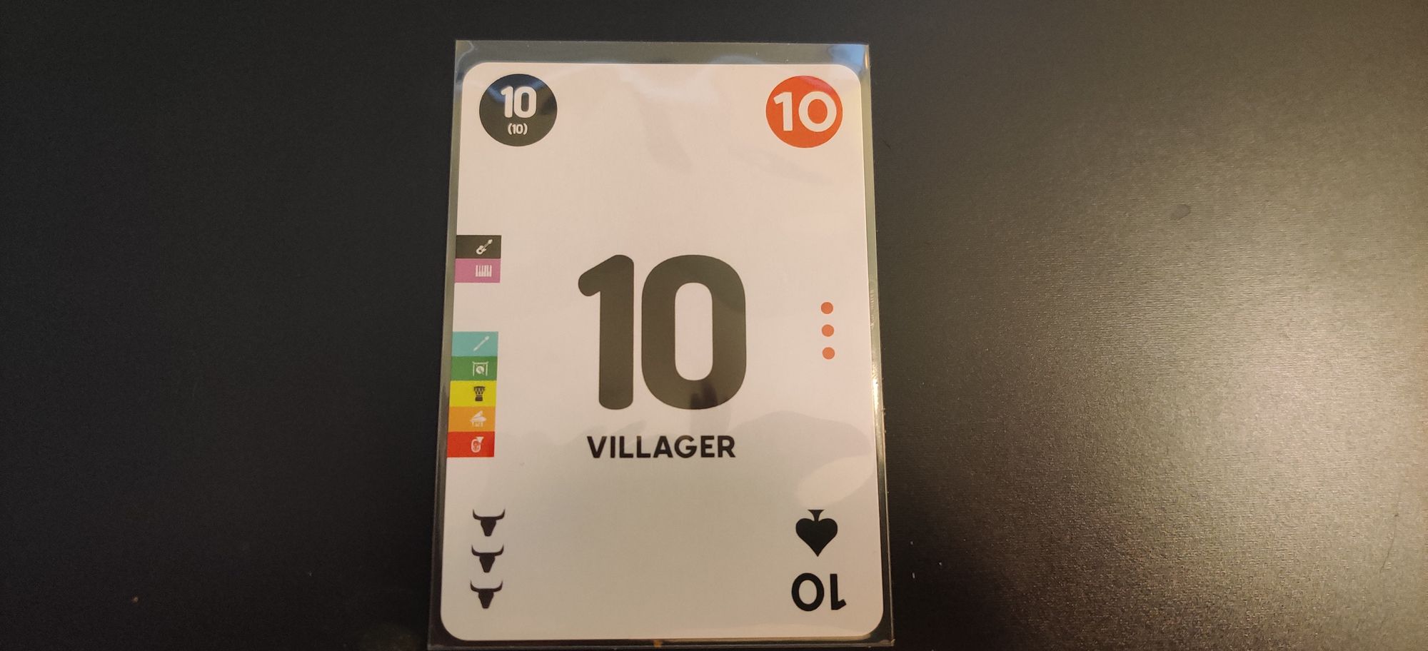
Some cards I really like, especially the ones in the smaller numbers where they are used in a lot of games. Something like #10 is full of information which makes its design quite balanced. Every corner, both sides and the middle has something out there.
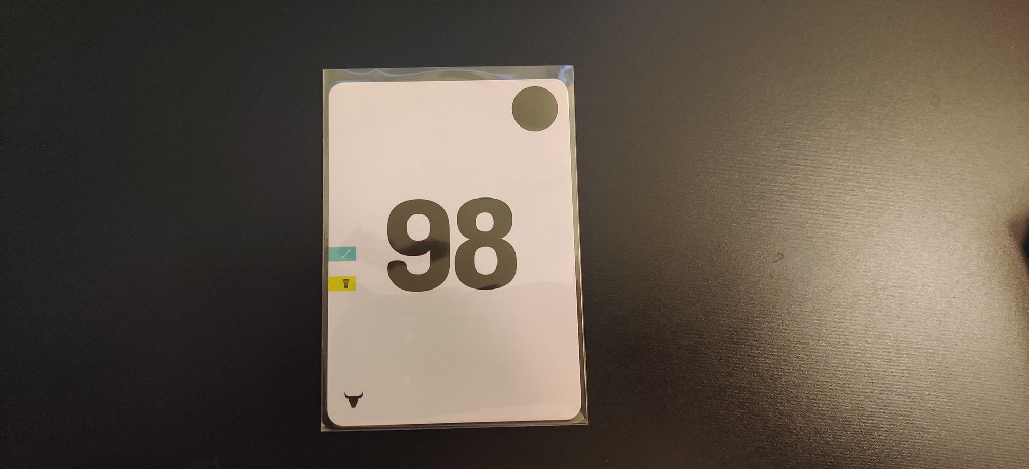
Other cards, like #98 feel a bit naked and less carefully designed because they only serve their purpose for a few games. I do hope though that it's just a thing when looking at them in isolation and doesn't bother as much when playing games.
I used multiple different fonts in these cards and I'm not 100% sure what I think about that yet. One reason for that was to make different games look a bit different so you'd get used to looking at the right numbers and would feel weird if accidentally looking at a different piece of information when playing.
The indexing system is good and it works and is generally my favorite part of this deck's design. It looks pretty damn cool when the deck is stacked and fanned just a tiny bit.
It took a month more to be delivered than promised and was marked as Completed on MakePlayingCards.com's website over a week before it arrived which was my first bad experience with them. I was pretty sure at one point that I'd never get my cards. I'm happy they arrived eventually.
There are some design flaws that ended up in this prototype because I was too shortsighted with my process. Even though I made a great indexing system, I still made the mistake of trying to convey that information through elements too.
The biggest miss is that I didn't add the numbers in the top left corner for cards that weren't included in Texas Showdown. It would not have hurt the Texas Showdown game play (because of the index) but it would have highly improved every other game that relies on those numbers.
Another oversight that I actually thought about but decided not to do and regret now was to not add four additional suits to the standard playing card decks. Many other universal decks have introduced other suits and there are a lot of games that could have been played with those extras so it was just my laziness not to include them. The empty space was there for me to take advantage of and I didn't.
Wrapping it up
All in all, I'm really happy I got this project done. I can fit all these games I love into my backback wherever I go, meaning I can play more games more often. I learned a ton about universal card systems and card design that will be beneficial in the future even if all that new knowledge didn't contribute to this project quite yet.
As soon as I got the cards to my hand and was able to solo play a few different games and go back down the rabbit hole of universal systems, I already got a few new ideas for the future projects.
And that's the beauty of it. Building these prototypes and hobby projects for my own use is such a great way to learn and improve as a card designer.
I think my next project will be an evolution of this idea and leaning even heavier towards the universality. Meanwhile, I'm able to spend the Christmas holidays with family and friends playing games without having to bring in an extra luggage for just games.
A sidenote: 2-player Pokemon Solomon Cubes
Before we go, I wanted to quickly share another cool project that I built. I love Pokemon TCG and I like drafting and while the main game isn't very suited for drafting, cubes are custom-built collections of cards designed for drafting.
I recently built two very special style cubes, both meant for 2-player drafts, a bit more unique format, designed to be drafted in Solomon Draft format. One is focused on the very early sets of Pokemon TCG and is designed by Andrew Mahone. The list for the other one was sent to me by its designer TheGyroscopeEevee and it focuses on the SP era cards.
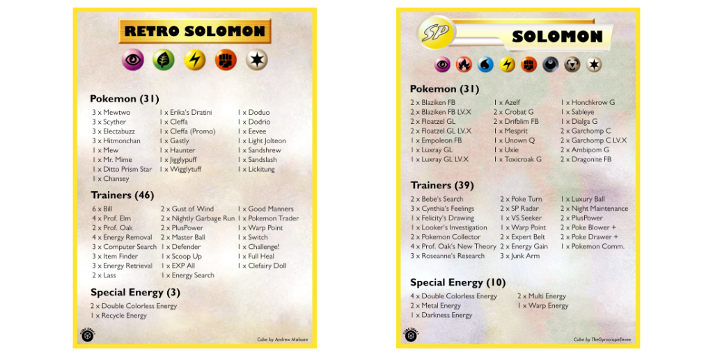
Both of these are 80 cards + energies so I designated a UG Flip'n'Tray deck box for each and designed index cards above to have an easy-to-find list of cards included in the cubes when drafting.
If something above resonated with you, let's start a discussion about it! Email me at juhamattisantala@gmail.com and share your thoughts. This year, I want to have more deeper discussions with people from around the world and I'd love if you'd be part of that.